Version 1.5Panel user guide
API Quick Reference
JavaScript is required to use the quick reference
Overview
The glow.widgets.Panel widget places a box on top of other elements on the page. For example, Panel can be used as a substitute to popup windows and alerts, or to display large images.
Panel comes with a built in design which can be modified using CSS, or a completely different HTML template can be provided.
Panel extends glow.widgets.Overlay, all methods and properties of Overlay are available in Panel.
Using the Panel widget
Creating a basic Panel
It is often desirable, for accessibility reasons, that the content for Panels come from an existing element on the page. When this method is used, the Panel will hide the content on the page until it is shown.
Panel will react to certain class names on the children of your content element, and use them to determine which bits of content are to be used in the different parts of the Panel:
- hd
- This will be added to the header of the panel. This is required.
- ft
- This will be added to the footer of the panel. This is optional.
HTML in the document:
<div id="simplePanel"> <h2 class="hd">My simple panel</h2> <p>This is a simple glow panel</p>
</div>
My simple panel
This is a simple glow panel
JavaScript
//create Panel instance
var myPanel = new glow.widgets.Panel("#simplePanel");
//display panel
myPanel.show();
The first parameter of the constructor idetifies the content of the Panel. This can be an array of nodes, a single node, a CSS selector (as supported by glow.dom.get) or a Glow NodeList.
By default the Panel will appear in the center of the screen and be modal. When the Panel is modal, clicking on the mask will hide the Panel.
Under those circumstance where is not desirable that the content come from the page, then a NodeList of the content must be created.
var myOverlay = new glow.widgets.Panel( glow.dom.create('<div id="simplePanel"><h2 class="hd">My simple panel</h2>' + '<p>This is a simple glow panel</p></div>'), { modal: true }
);
myOverlay.show();
Refer to the API for how to change the mask and position of the Panel. These features are also covered in the user docs for Overlay, which Panel extends.
Basic Customisation
Every panel has a container property to which you can add your own class names. You can then use this to style the content of your panel with CSS.
The panel has a default width of 400px, which you can alter. The deafult style has 20px of design on the left and right, giving 360px of content width by default.
HTML in the document:
<div id="myLightbox"> <h2 class="hd">Husky in Ruka</h2> <img width="500" height="334" alt="" src="/staticarchive/facf7d9bb8560dccab442411804ce40f39d81996.jpg" /> <p class="ft">Copyright 2008</p>
</div>
Husky in Ruka
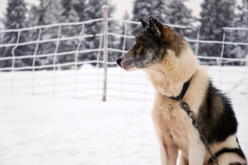
Copyright 2008
CSS
div.husky-panel { font-family: verdana, sans-serif;
}
div.husky-panel img { display: block; margin-top: 10px;
}
div.husky-panel p.ft { border-top: 1px solid #777; font-size: 0.6em; padding-top: 5px; text-align: right;
}
JavaScript
//create Panel instance var myLightbox = new glow.widgets.Panel("#myLightbox", { width: 540, theme: "light", modal: false, anim: "fade"
});
//add custom class name
myLightbox.container.addClass("husky-panel");
//display panel
myLightbox.show();
Widths and positioning can also be expressed as percentages.
Two themes are currently available for the default Panel template. "light" and "dark".
Panel inherits from Overlay, so Panel supports Overlay's animation options. In the example above, the preset 'fade' is used. Other presets are available and custom animations can be provided. See Overlay user docs for more examples of animation.
You can access the content of your Panel through the 'header', 'body', and 'footer' properties. If you have multiple images to display in a lightbox, your footer may contain navigation to switch between the images.
If you want to alter the style of a particular panel, you can use the 'content' property (from Overlay) to add a class name to it.
myLightbox.content.addClass("myLightbox");
Refer to the API for more details.
Advanced Customisation
Panels can be customised to a very advanced level. See the separate guide to restyling a Panel for full details.
